Think about the last time you signed up for something online. It might have been a newsletter, an app or maybe an online course. During the process, you’ll have clicked on a call to action (CTA). The CTA of an ad is arguably the most important component. It’s your way of saying to the user what they should do, when they should do it and even how they should do it.
For example, ‘Click here to buy now’ tells the user what to do (click), where to ‘click’ (on this button or link) and what clicking will result in (buying the item now).
The copy of any given CTA will vary depending on the context which includes factors such as audience, verticals and what your actual offering is. Let’s say you’re selling a product and you want to launch a series of ads to promote that product launch. The obvious CTAs would contain words such as “Buy” or “Shop” or maybe even “Get.”
If you were to offer a service or a class, you might consider using action words such as “Learn” or “Discover” or “Sign Up.” The impact that each word has on a CTA is amplified by the simple fact that there are usually only 2-4 words used.
What all top performing CTAs for ads have in common
There are a few things that all great CTAs have in common, so it’s best to keep these in mind before you start piecing together your next campaign.
- They’re logical: don’t try to reinvent the wheel with the CTA copy. Focus on making sure they make sense to the reader above all else. At the end of the day, they’re just 2-4 words on a button – they can’t be anything else!
- They’re compelling: “Buy this” is not compelling. “Start free trial” is a lot more enticing, and placed after some compelling lead/headline copy and you’ll be onto a winner.
- They’re easy to read: CTAs are not the place for long, obscure language. Keep it simple, concise and clear.
So, are there any examples of top performing CTAs for ads that you can apply to some future campaigns? Sure, let’s take a closer look at some actionable copy that will leave your users with no choice but to convert.
Examples of top performing CTAs for ads
One thing to keep in mind with CTAs is that you’ll notice similar copy being used across ads, homepages, pop-ups or newsletters. The point is that regardless of where you place the CTA, the copy has to make sense.
That’s why you’ll notice in some of the below examples that we’ve drawn copy from CTAs that are used in places other than ads.
Try [INSERT PRODUCT] free
The first example of a CTA that performs well is one which suggests the user can try a product or service for free. It’s a win-win situation. If you like the product – brilliant, you’ll probably want to then go onto the paid model. If you don’t like it, at least you’ve had a chance to test it out and who knows, you might know of someone who could benefit from it where you didn’t.
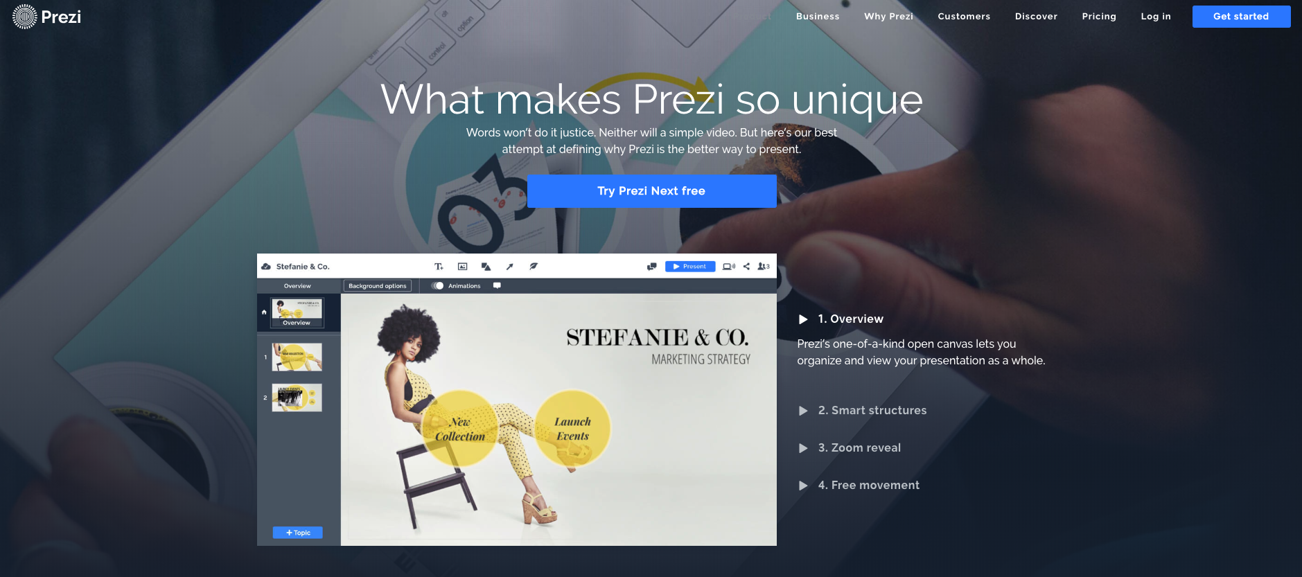
The example below is from Prezi, the presentation design tool. They’re offering users the chance to try out ‘Prezi Next’ for free. Pretty clear, right?

Sign up for free
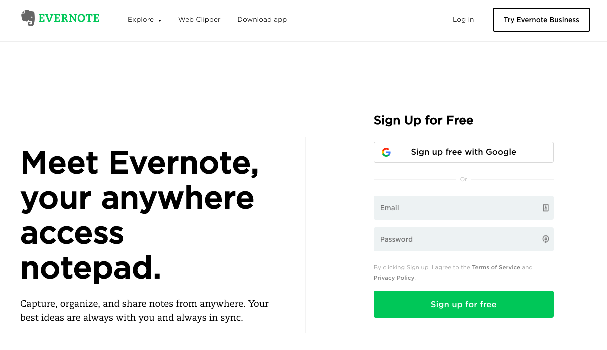
Next, let’s take a look at one of the most commonly used CTAs (as seen utilized by Evernote below). “Sign up for free” is similarly effective to “Try for free” but it is applied to a different context.
For example, Evernote has a free version that you can use, so when they say sign up for free, they mean you’re literally signing up to use their service for no cost – no strings attached. It’s yet another example of how important using a clear and concise CTA is.

With some practice and plenty of testing, you’ll be running some high-quality CTAs of your own in no time!


